Health
Laminate floor? Here’s what to choose for a stylish home
The style of the furniture starts from the choice of the color of the floors, which determine the mood of the rooms.
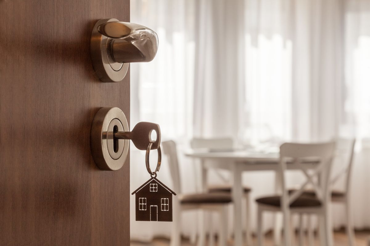
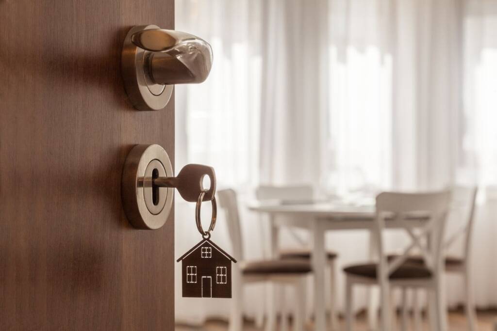
There are numerous solutions in this regard, each of which can be perfect for one style compared to another, there are many effects and materials that can be chosen. If you are a lover of wooden floors but have limited financial resources and at the same time are looking for a more functional solution than normal parquet, the laminate floor proposed by Iperceramica is certainly the most suitable solution.
Laminates are floors made up of several layers. The one on the surface consists of a protective film with printed paper that reproduces the patterns of the wood essences which can also be adapted to the grain of the surface ripples, thus giving a realistic appearance. The load-bearing section consists of a central panel of wood fibres; a stabilizing support is what makes up the underlying part.
However, there are different varieties for this material that can give completely different sensations and effects; different colors of laminate that can make the house full of style.
What to do before choosing colors
The choice of the most useful laminate color for a domestic environment or for a single room must be carried out by following the classic principles of the choice of each floor. First of all, it is necessary to consider what style you want for the house (and therefore what furniture and accessories will be used later), the colors you want, especially for the colors of the walls and for the colors of doors and window frames, as well as other elements such as curtains.
Another consideration to make is that relating to the possible presence of external environments , which must be enhanced by choosing a solution in continuity or in discontinuity. Therefore, when choosing laminate it is always better to do so with all clear ideas and well-defined projects, so as not to end up with wrong combinations that risk creating a flat visual impact, with an unpleasant overall effect.
White laminate for an elegant home
If you are looking for a refined solution for your home, the right laminate is the white one, suitable both for rooms with a modern style and for rooms with a more classic imprint. It is a choice that can be a good starting point, especially if combined with brightly colored furnishings, or always remaining on even more accentuated wood tones: in this way it is possible to create a chromatic contrast that is not extreme but certainly fascinating .
Gray laminate: neutral and with character
An effective alternative to white is certainly the gray laminate , a neutral color in the same way and which lends itself perfectly to structured furnishing styles in pastel colors and not too bright tones, especially as regards the colors of the walls: in this case the contrast must be studied well and must not be too dissonant. Furthermore, gray can be easily combined with not too large furnishing accessories; conversely, tone-on-tone or light contrast is recommended for furniture with large surfaces, such as wardrobes.
When light wood is good
If you are looking for an alternative that perfectly imitates pre-finished parquet, the advice is to opt for a light wood-effect laminate . Excessive contrasts in this case can be problematic and therefore it could be good to avoid combinations with too dark furnishings. Furthermore, depending on the pattern and effect of the slats, you can vary between a minimalist design and a slightly more rustic one, depending on the shades which can be warmer or colder.
When dark wood is fine
Dark wood-effect laminate floors are the smartest solution for a rustic-style environment, even more so if in rural contexts, but if chosen carefully, perhaps by combining the furnishings and wall colors well, it can also be useful for contexts modern and minimal. It must be remembered that contrasts that are too excessive can become too heavy; the best combination can therefore be the one with light-colored furniture, even more so if you opt to focus on tone-on-tone, in order to avoid flattening the result and making it oppressive and giving a sense of less spatiality.
Riproduzione riservata © - WT


Why Italian research relies on citizens: Unveiling the funding puzzle
Understanding the complex mosaic of research funding in Italy: How state, enterprises, and citizen contributions shape the scientific landscape. In...


Discover the secrets of blood tests: when, why, and how to get them in Monza
Understanding the optimal timing and comprehensive nature of blood tests: A guide for residents and workers in Monza looking to...


Discover the secret ingredient for healthier hair: why everyone is talking about tea tree oil
The growing popularity of natural solutions for body and hair care highlights the versatility of tea tree oil in enhancing...

Discover the 2026 home design trend that’s redefining comfort and serenity
The shift to a more curated and calming home design that prioritizes human well-being over aesthetics is taking center stage...


The surprising rise of intimate aesthetic medicine: What you need to know about male enhancement trends
The rapid expansion of intimate aesthetic medicine: How innovative treatments are revolutionizing the landscape of contemporary healthcare by focusing on...